That’s Das Auto
A VW doesn’t just start off as sheet metal and engine parts. It begins as an idea. A belief that getting the little things right is a big thing. A viewpoint that says why dumb it down when you can smart it up. An attitude that says to make things perfect, you have to make them perfectly. Some would call that just a bunch of good ideas. We call them Das Auto.
Volkswagen is a company driven by design on every level, and their Brand Program is a shining example of consistency and quality. Everything from the welcome mat at dealerships to National campaigns are linked through a deliberate visual language and a set of organizing principles that guide photography, shape, color and structure… as well as the intelligent story, personality and tone of voice.
Omni-channel Campaign
In partnership with Oracle ECD, Shane Greenwood. 3D Illustrations by BUCK.
Radical Curiosity
Since 1967, the College of Creative Studies at UCSB has provided a small intellectual community of committed undergraduate students and faculty set within a major university. CCS students and their faculty advisors work together to design a study plan that encourages students to take risks, to explore, and develop their passions. Whether it is producing creative work or conducting original research, students are inspired to make significant contributions to their field.
Paul Rand taught us that a logo derives its meaning from the quality of that which it symbolizes. We were deeply honored to create the first identity for the College of Creative Studies at UCSB after their 50 years of greatness. It was an incredible experience working with the giant minds who run the school.
Curious Goods for Curious People
The Shopkeepers is a place where people can gather, shop, create, learn, and experience the best from California's unique culture. Their products are like words on a page and their stories enthusiastically shared. Their space is open and inviting. Their events are inclusive and inspiring. They hope people visit and shop often, stay as long as they like, and leave feeling better than when they arrived.
There's a Champion in Here
Innocean, the advertising agency for Champion called on us to help express their compelling big idea that within everyone lies the heart of a champion, especially when driving a vehicle. The request was that we evolve the classic American business into a lifestyle brand. We started with their auto parts packaging, and took the approach that functional packaging can be totally cool. We commissioned fine artist Coop (who is steeped in Hot Rod culture), and asked him to celebrate each car part as a thing of beauty and paint them in his distinctive graphic style. We crafted a product driven system that maintains Champion's original style cues with a brand new look.
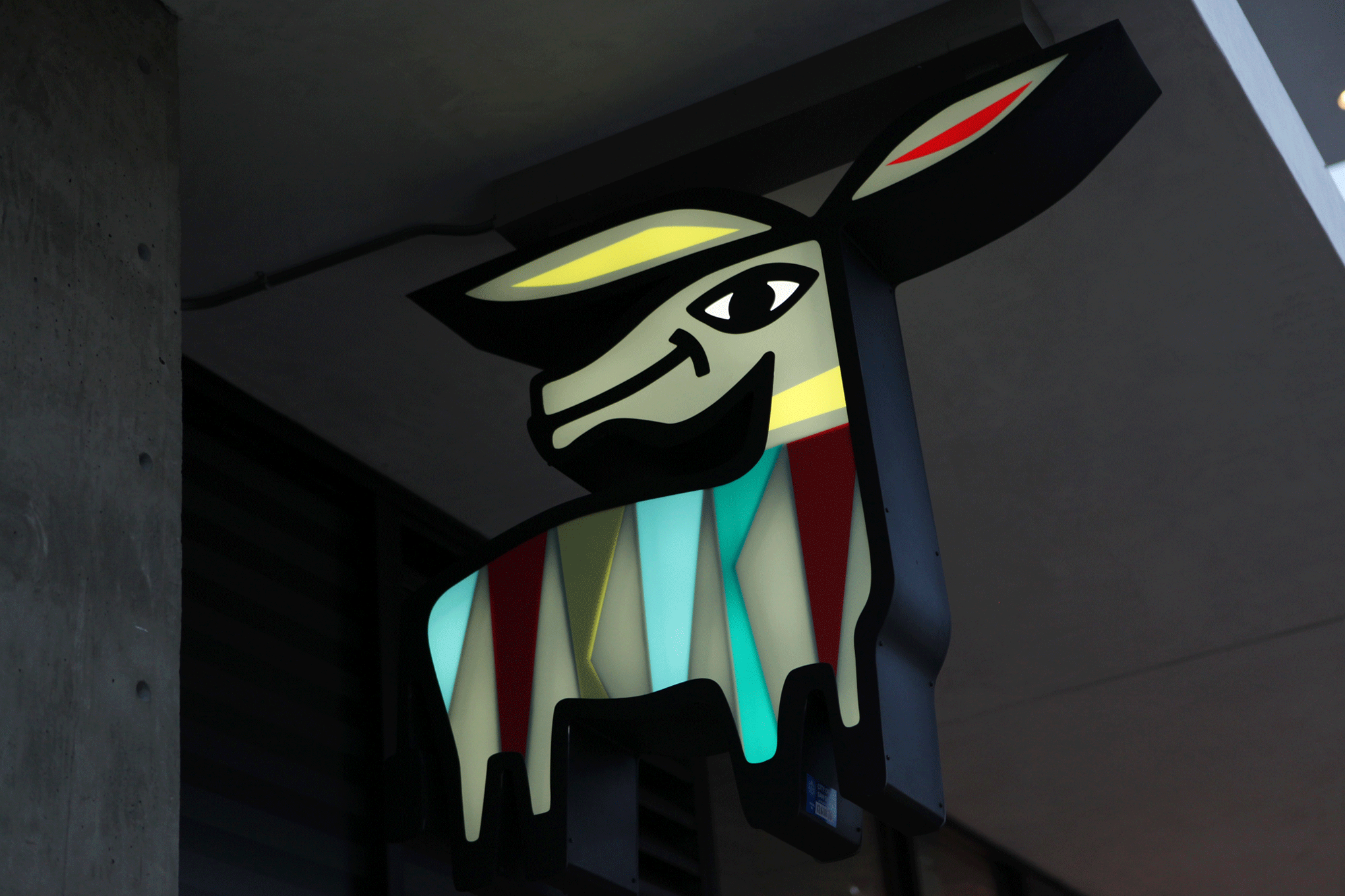
Gomez says “¡Hola!”
Tacos Perla is a new brand that is taking the street taco out of its humble roots and sending it to design school through modern flavor riffs along with delicious classic recipes. We created the brand identity to be evocative of great Mexican design mixed with contemporary styling. Through our research we discovered the handcrafted charm and imperfections of the artists’ alleys in Tijuana and reflected that in the branding of Tacos Perla.
The symbol we created for Tacos Perla is ‘Gomez’ the zonkey. He’s a modernist graphic interpretation of the famous painted zebra-donkey that became the faded Polaroid souvenir of a visit to Tijuana. We based our color palette on the streets of Tijuana and then reinterpreted it through high design. The end result is an identity that feels real and is served up fresh with a lively, Mexi-modern twist.
Same Soul, Different Everything Else
There has never been a more iconic shape than the Volkswagen Beetle. What other product on the planet is as instantly recognized by its profile alone? It’s a profile that has always been a universal symbol for cool, and is a constant reflection of culture.
Like the times themselves, the Beetle continues to evolve. The Twenty-first Century model marks only the third significantly different profile of the world’s most iconic automobile. And it’s all new.
Dine with a Legend
Michael Jordan's Restaurant is a stand apart approachable steak house with an immersive, sports driven, social dining experience, distinguished by the iconic personality of Michael Jordan.
Most of us will never have the chance to dine with Michael Jordan. Our branded environment is intended to bring us as close as possible. Inspired by Michael Jordan’s refined swagger we designed every element in the restaurant to provide visitors opportunities to feel like they are in the presence of the man and help make it seem like he’s there talking, sharing his competitive spirit, pouring some of his magic into their night.
A Beacon on the Beach
The Point Conception Institute (PCI), a conservation research group based at the Point Conception region of Central California. It straddles a major ecological boundary where California’s northern and southern terrestrial and marine regions meet. This magical place acts as a living laboratory to facilitate leading-edge research in one of the most biologically diverse habitats in the world. The PCI itself is made up of environmental scientists, research partners and conservationists, working together to foster collaboration, tech innovation, and data science to boost ecosystem resilience to climate change and promote the value of nature in an increasingly human-impacted world.
Copywriter: Kevin Butler
Conscious Style
Road Twenty-Two makes luxurious basics based on the precept that love is in the details of everything. Road Twenty-Two is here not over there. It’s insourcing not outsourcing with the belief that what you do matters and what you wear matters. It’s conscious style.
Road Twenty-Two is committed to employing women who need a chance and to bringing manufacturing back to the United States. They want to humanize the image of women who were formerly incarcerated, homeless, or suffering from substance abuse, and to break through employment road blocks. Their goal is to change people’s lives.
Uplifting, exciting flavor and design.
Holsem is a Third Wave specialty coffee shop with amazingly delicious coffee beverages paired perfectly with high-end pastries served with deep care and natural smiles. It’s affordable convenient luxury that freshens daily and is an ideal gathering spot to feel connected and alive.
The Journey to Urbana
Urbana is a place in our collective minds. A place that connects us to the best aspects of west coast city life and beyond. Incredible nature, amazing music, art, food, ideas, and like-minded people, all inspired by the finest cannabis in the world. This is a lifestyle brand for a life well lived.
The space feels open and light, with interesting artistic touches, and an energy that there’s something happening here. You feel the excitement of potential - a whole store dedicated to answering the question: How do you want to feel?
You also sense a spirit of belonging. Because it’s staffed by people who appreciate the joys and wonders of cannabis. Like that special bond you have with anyone you’ve ever shared a joint with, you feel accepted, regardless of your experience with the plant.
Copywriter: David Begler
It starts with a drop.
One drop might not seem like much at first. But the funny thing about drops is they eventually become much more. A flow, a stream, a wave, an ocean. It may feel like a small start, but by simply choosing Brita, you are joining a collective of people who believe small choices can add up to meaningful change. And that together we can make real impact, from making water healthier for you and your family, to eliminating plastic waste from the planet. The cascading droplet is our trademark because we filter water and create connections drop by beautiful drop. And as a result, we bring better water to people and the planet.
Copywriter: Shane Greenwood
Happy Birthday
The cupcake phenomenon was still relatively new when Kara and Michael Lind decided to start their business. They both have impeccable taste and we partnered with them from day one to establish a solid brand image and retail vision that could match the quality of their delicious cupcakes which use only local and organic ingredients. Kara had a picture of herself as a child eating a cupcake on her birthday that she remembered fondly. We wanted to signify happy times elevated with a modern sensibility.
r.
Hit in the Mouth with a Pig!
Lovably loud and delicious. Layers of flavors exploding on your tongue. Seafood bombs dropping from the bowl. Ejji Ramen is a vivacious, inclusive fast casual dining spot where culinary chops meet an easy going culture animated by wit and humor.
We partnered with Steve Seto from Brand Transformation to develop an identity with a bold mix of ingredients that are as bright, lively, tasty and original as Ejji itself. The character, color and content of our design language announces Ejji's big personality and promotes the upbeat locations and delicious food.
Just say Yep
Yep is Urbana’s house brand and house philosophy: that every day is an adventure, and good cannabis enhances it. Yep is their hand picked selection of ever reliable flower. Exceptional, affordable strains from farmers they love and trust. Yep is an invitation to rise to the occasion of whatever the universe happens to throw your way today. It’s good flower for good people. And yep, that means you. Enjoy.
Copywriter: David Begler
What’s a signature worth?
Levi Strauss & Co. needed to create a new brand for the mass market channel that was as durable as the original jean, affordable and at a glance said ‘Levi’s.’ There were products for each member of the family, so everything we created speaks to that person in their own language while still holding together as a series for the brand.
Simple Delight
Birdie is a lifestyle fashion brand with a golf soul. It’s tailored for the youthful, style conscious woman who wants to look great on and off the course. Rooted in golf, but designed for fashion, Birdie exists in a world of its own.
The narrative of Birdie begins in Palm Springs where there’s a combination of classic golf roots and a swinging heritage. Palm Springs is a cheerful place where the golf course and night club combine. It’s modernist setting of mid-century architecture and optimism provide an ideal backdrop.
California Goodness Delivered
Americans have an unbridled love affair with pizza. It is by far the most popular food and restaurant type nationwide in virtually every state. While pizza seems like just one of life’s little pleasures, it actually takes on a much bigger meaning to people. That’s because pizza is their favorite food and go-to choice for comfort. It’s a great, easy and convenient way to add happiness and satisfaction to people’s lives and families in otherwise busy and sometimes hectic days.
The name, identity, packaging, delivery vehicles, uniforms, store design, advertising, etc… collectively aim to elevate Lovebug Pizza to a level of fanatical, almost spiritual devotion, through expressions of love and pizza.
Wisdom and Empowerment
Lefkowitz & Company helps people navigate their business and personal financial journey. Partnering closely with their clients, they solve financial issues by leading individuals down their uniquely ideal path, so they can make the best use of their time. Lefkowitz & Company are experts at their craft who serve with wisdom and heart in support of life’s goals.
Down to Earth, Up with Style
The Pearl Hotel is in historic Point Loma one block away from beautiful San Diego Bay. Point Loma is a renowned boating community and residential neighborhood where visitors and locals alike, marvel at row after row of eclectic sea vessels docked along the waters. The Pearl Hotel sports twenty three designer rooms of comfort and distinction, each freshly renovated with an exciting contemporary feel, laced with an audacious dash of vintage-modern flair.
A builder of people / building beautiful buildings / helping people live better lives.
Confluence are uniquely qualified gritty modern gentlemen builders who combine the power of design and the efficiencies of vertical integration to visualize and monetize extraordinary design-built real estate projects that beautify the landscape while generating wealth for their investors and lasting inherent value for Seattle’s inhabitants and community.
Journey Through Innerspace
The project for Thin, a hyper-contemporary nightspot located in downtown San Diego was a labor of love. We came up with a concept called Travel / Anatomy. With style cues from 1960’s sci-fi classic “Fantastic Voyage”, we constructed a subliminal storyline that informed design of logo, signage, interior elements, furniture, glassware, uniforms, menu systems, bar items and interactive.
The space itself draws allusions to airports, train stations and laboratories. While there are clues suggesting a way to define Thin, the ultimate answer remains just out of reach. This mystery is intended. It provides a unique experience; one that is enigmatic and ever changing.
“When you know better, you do better.” - Maya Angelou
We are in the midst of a youth mental health crisis. Our world is increasingly stressful, inequitable, and disconnected. Even before the pandemic exacerbated these issues, rates of depression and anxiety among young people were on the rise. Demand for resources is at an all-time high, and we do not have the clinical workforce to accommodate the needs of our most vulnerable youth. The Sarlo Family Foundation is focused on sustaining upstream mental health models that promote wellbeing and resilience. Where possible, we look to influence public policies and systems whose reach and resources exceed ours. Our primary aim is early intervention, before more serious mental health and life outcomes arise. Our desire is to enable culturally-responsive community-based resources to meet young people where they are, with solutions that help them meet their unique needs.
Copywriter: Julie Gordon
Grape Juice
Lioco is a new kind of wine company launched by an experienced wine seller and the sommelier of Wolfgang Puck’s restaurant, Spago. The partners choose to make wine from locations all over the world, and aim to demystify the experience by educating consumers in a direct and honest way. In support of this concept, we designed labels intentionally void of decoration with an organizing principal that helps people easily understand the wine.
A Higher Perspective
Above the Grand produces beautiful and relevant content from a different viewpoint than the typical movie insider. Their approach is not meant to please everyone. Each project is different. Each audience is unique.
Take the Walk
The goal of this brand refresh was to make The Waikiki Beach Walk even more famous. We were charged with creating an authentic experience that engaged the senses and restored meaning to the Waikiki Beach Walk brand.
This design program needed to be unique, scalable, ownable, appropriate and merchandisable. We wanted to connect with both visitors and locals through an authentic experience that inspires visits and return visits. In essence, we worked to bring back the romance of Waikiki and capitalize on its many unique entertainment opportunities.
Built for the athlete in all of us
As part of an in-depth rebrand for Apex Fitness we made a careful study of the energy bar marketplace. We arrived at an obvious yet significant discovery : it’s nearly impossible to distinguish the function of each product. Some are for men, some are for women. Some are high protein, some are high carb.
We established the immediate goal of setting clear categories based on the benefit of these functional foods. We then developed a brand architecture that would identify the categories. Following our redesign and new merchandising plan, sales increased 400 percent in the first month.
Make It A Great Day
The rebrand of the LWP Group began by first establishing their core values. Working together with the LWP team we determined they are a serious, visionary company that uses creativity to breathe new life into urban environments for better living. A brand that enjoys improving how people live, work and play. A brand that is committed to exceptional guest experiences in service-driven, design-rich environs.
We then designed the identity system, website and marketing tools that showcase and support these values. The result is a fresh, joyful, bold and colorful brand expression that matches LWP’s approach to development and life itself.
A Drop of Nectar
Evolve Nano Nutrition offers a revolutionary way to receive vitamins and nutrients through liquid droplets that is ten times more efficient than capsules and pills. To promote this next level delivery system we designed a sophisticated and trustworthy looking brand system that visually expresses the fluid, vital product within.
Deep Dark Ocean
One of the world’s premier big wave locations, Mavericks, happens to be just thirty miles south of San Francisco. We were hired to launch an apparel line based on the spirit of the ominous reef break. Styled for the Northern California surf scene, our approach was to foster brand loyalty by creating an aesthetic that represents the core tribe of elite surfers that frequent the place. Mavericks is a legitimate phenomenon that can only be successfully promoted by respecting authentic surf culture.
All business. No trip.
Deem builds modern all-condition business travel software that removes distractions a with more predictive approach and offers seamless support for everyone involved. They understand every point in the journey and synchronize everything to make it easy and cost effective. They’ve removed the friction and automated the booking, service and expense reporting to provide the best path forward.
Rather than aim for a predictable identity system that suggests a stiff business software product, with Deem's blessing and enthusiasm we designed a brand look that exhibits the adventurous spirit of travel.
Copywriter: Richard Manley
Inner Strength
There’s a quiet confidence and deep inner strength that comes from knowing who you are and what your truth is. Tracee Nichols jewelry is much more than brilliant adornment, it’s tokens for bold living worn as personal expression. The brand identity inhabits strength with elegance and grace. Its style reflects the precious materials and luxurious quality of Tracee’s designs and, at the same time, its form takes a sturdy stance while remaining balanced, sensual and kinetic. It serves as a reminder that there is great strength in beauty.
Living Snapply
Snapple’s success stemmed from tireless efforts to collide the extraordinary with the familiar. After all, life is full of good stuff. You just have to know where to look and how to look at it. Find that perfect balance of extraordinary and familiar and you can bet your britches you’ll also find a smile on your face.
The time came for a new Snapple look that communicates the positioning, personality and philosophy in a way that reminds you that life is good. A visual language the brand uses that is crafted with the same passion, care, and loving attention to detail that Snapple puts in every bottle.
For a more impactful presentation, rather than type up a strategy deck and print out some mood boards…we built The Snapple Lounge – a dimensional expression of the brand persona and an immersive look at Snapple’s future.
A World Without Waste
Recology Organics creates premium compost and landscape products by converting people’s everyday yard trimmings and food scraps into earth-friendly, nutrient rich soil amendments that help farms and gardens throughout California and Oregon live a healthy, happy, more productive life. So instead of ending up in landfills, these diverse natural resources can serve their best and highest use, feeding the earth from which they once came.
They asked us to create a Recology Organics sub-brand that told this story while also supporting the overall Recology brand. We brought the sub-brand to life through the creation of: a new logo lockup and tag line, illustration, storytelling, packaging, outdoor, collateral and web. But you might say, there’s something else we’re helping to create that’s just as important: A World Without Waste.
Perfectly Balanced
Tune is a Chiropractic Health & Healing practice that treats the whole person harmonizing body, mind, and spirit. They are dedicated to providing innovative, specialized services that balance and empower peoples’ lives. People come to Tune to feel better, create a more active life, and discover better overall health. Their trademark symbolizes an aligned spine and the trio of body, mind and spirit (as well as the letter T for Tune). Their Visual Identity System suggests the warmth and glow associated with healing.